
No terms found for this post.
A picture is worth a thousand words. Good visualizations speak for themselves, saving the expensive stakeholders' time while presenting a data project. Unfortunately, raw data exploration plots are often confusing for the general audience no matter how good the visualization library is.
The visualizations require fine-tuning to make them easily accessible for the untrained eye. Adding sufficient navigation and context to a plot is crucial to deliver the main idea behind the analysis to the stakeholders. Otherwise, a large chunk of time will be wasted on explaining what is on the plot rather than talking about the implications. Though tempting, such a tradeoff can push decisions on a critical project by weeks or months.
In this blog, I will share the pieces of code that make visualizations easier to read with the help of Python plotting library Matplotlib. I will also share time-saving approaches when you start working on a new visualization. The material is intended for data scientists who spend significant time exploring data and using the results to help stakeholders make business decisions.
The Python community owns a number of powerful visualization libraries. Those include Seaborn, Plotly, Bokeh, Altair, Pygal, and Plotnine, among many others. These libraries compete in how much insight they can cram in one graph with a single plot command, which helps tremendously when it comes to data exploration and discussing intermediate results with fellow data scientists. However, business stakeholders get confused with the complexity of such elaborate visualizations, especially if presented in a raw form. They did not read the dataset documentation to guess that cty on x axis is the fuel consumption in the city, may not be aware of the average for the industry to compare it with, or did not have training about where to look at in a box plot.
It is on us data scientists to make the graphs easy to read. In other words, the author has to make the effort to go from a pretty picture to an informative graph, but this step is often omitted because the author believes that if he knows where to look, then it is obvious to everyone else too.
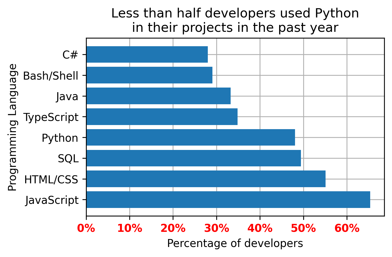
A data professional is responsible for focusing stakeholders' attention on the points they want to know. This last mile from a flashy picture to an informative graph requires significant effort. For instance, let's say, I found a function from a new visualization library that fits my data perfectly and renders plots like the following (click here for the source):
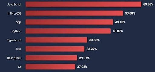
Looks slick, but I will have to spend time explaining what was measured for each of the programming languages. Even after that, it is unclear what message I want to get across and where to look for justification. Each mental step that a stakeholder has to take while reading the plot increases the chances of misinterpretation and the overall confusion. Simple steps such as adding an x label or writing a title do the job but get often omitted. Memorizing the corresponding commands for each new library or Googling the documentation every time is not impossible but tedious.
Instead, I want to concentrate on the tricks that cover the last mile using the standard `matplotlib` library. Matplotlib provides all the essential visualization functionality. The result might not be as flashy or interactive, but has all the means to bring the point across efficiently. Matplotlib is also the backbone for a number of visualization libraries, so the tricks will be useful for finishing plots generated with compatible libraries.
The above visualization can be delivered with Matplotlib in the following way:
import matplotlib.pyplot as plt
programming_languages = ('JavaScript',
'HTML/CSS',
'SQL',
'Python',
'TypeScript',
'Java',
'Bash/Shell',
'C#')
past_year_use = (65.36, 55.08, 49.43, 48.07, 34.83, 33.27, 29.07, 27.98)
plt.barh(programming_languages, past_year_use)
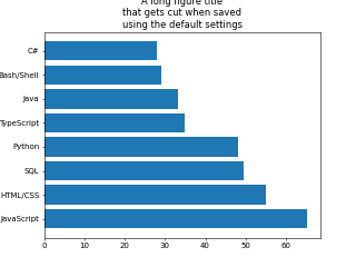
plt.show()The bare bones plot with `matplotlib` contains exactly the same information but looks even less intuitive than the original image. The following section will cover the steps for making this plot easy to read. The section after that will show ways of saving time on the tuning process.
The resulting plot will appear on slides or in documentation if it was saved in a file. However, the default saving options need adjustments more often than not. Default framing settings can cut out parts of the header, while the default resolution tends to create a pixelated outcome.
We as data scientists are responsible for making the final result look good on the screen where it is presented. The bbox_inches='tight' parameter makes every section of the plot fit, and cuts the excessive white space. The dpi parameter controls the resolution. Increasing the dpi value results in less blurry images at the expense of a larger file size.
plt.savefig('pics/demo_bar_plot_save.png', bbox_inches='tight', dpi=300)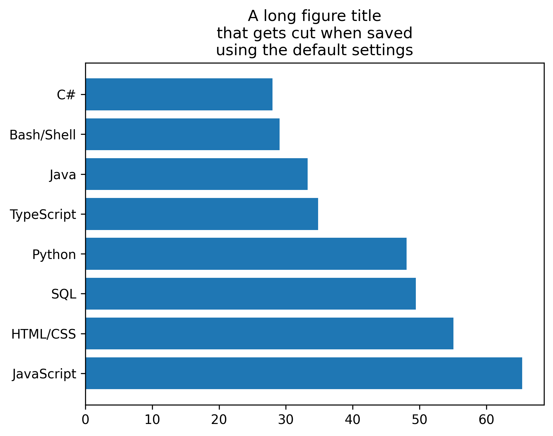
Plot size should be proportional to the amount of information we want to convey. Stretching the bars across the default size figure will only eat up the space without adding any value like in the following example from here:
Conversely, overcrowded plots will benefit from increasing the figure size.
The following code placed before the plotting function will set the figure width to 5 inches and height to 3 inches:
plt.figure(figsize = (5,3)) # set the figure size (Width, Height)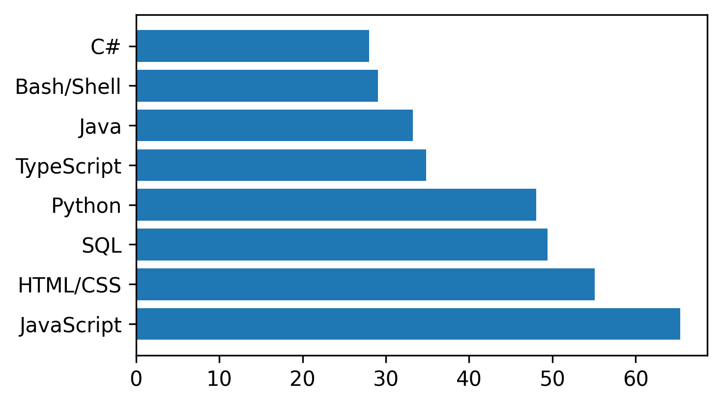
# plot preparation
fig = plt.figure(figsize = (5,3))  # set the figure size (Width, Height)
ax = plt.gca()  # get the axis from the plot
# plotting
handle_bars = plt.barh(programming_languages, past_year_use)  # the plot

plt.savefig('pics/demo_bar_plot_fs.png', bbox_inches='tight', dpi=300)
plt.show()The plot should inform the viewer about its content. Most visualization tutorials describe only the part of putting a graph together, while leaving the context dependent code up to the readers. The following example from this tutorial does its job demonstrating the library capability. However, it should never appear on presentation slides in its raw form:
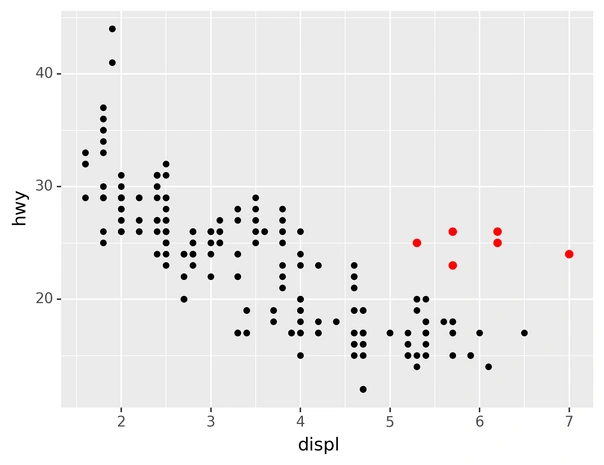
Even though the plot hints at something through colouring, it takes mental effort to figure out what the axes are and why the red dots are important. Title and labels straightforwardly deliver this information. Assumptions about these details are obvious lead to confusion, misinterpretations, unnecessary questions, and lengthy explanations.
Every plot should contain axis labels and a title. The title is the best spot to formulate the main takeaway from the graph. For instance, I want to bring across the point that, unlike my expectations, Python is not as widespread in developers' projects as some other programming languages. Therefore, I would set the title and the axis as follows:
plt.title('Less than half developers used Python\n'
          'in their projects in the past year')
plt.xlabel('Percentage of developers')
plt.ylabel('Programming Language')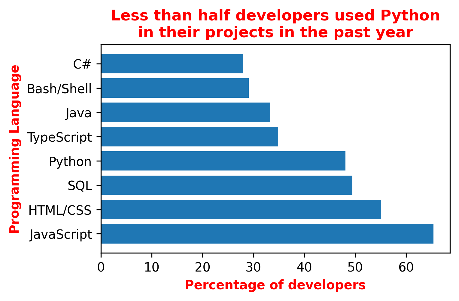
Even though this will still force my reader to make an effort to find the Python bar and compare its length to the others, the focus is already there.
# plot preparation
fig = plt.figure(figsize = (5,3))  # set the figure size (Width, Height)
ax = plt.gca()  # get the axis from the plot
# plotting
handle_bars = plt.barh(programming_languages, past_year_use)  # the plot
# fine tuning
highlighting = {'color':'red', 'fontweight':'bold'}
plt.title('Less than half developers used Python\n'
          'in their projects in the past year',
          **highlighting)
plt.xlabel('Percentage of developers', **highlighting)
plt.ylabel('Programming Language', **highlighting)

plt.savefig('pics/demo_bar_plot_ttl.png', bbox_inches='tight', dpi=300)
plt.show()Grid lines help perceive the differences between values on a plot. The effect is similar to how the lines on the football field help referees spot the differences between players' positions when calling offsides.

The following command sets the grid:
plt.grid(True) # show the grid
However, the grid lines appear on top of the bars by default. And that looks ugly. The fix requires extracting the axis object from the plot first before hiding the grid behind the bars:
ax = plt.gca()          # get the axis from the plot
ax.set_axisbelow(True)  # set grid lines to the background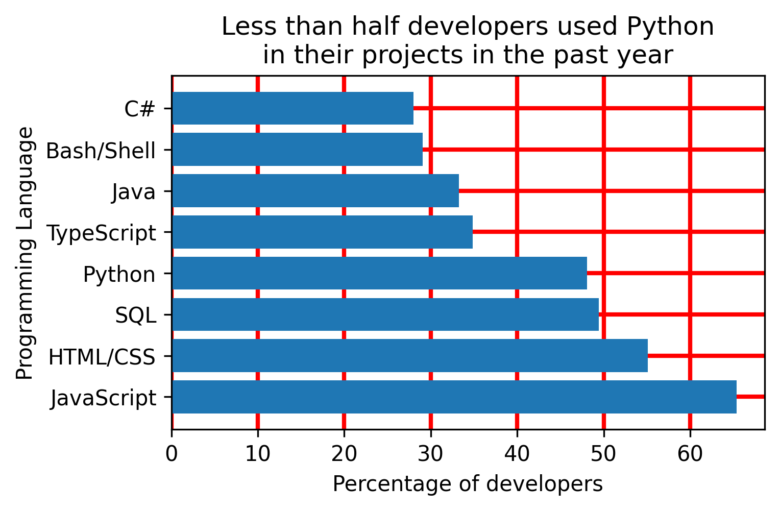
# plot preparation
fig = plt.figure(figsize = (5,3))  # set the figure size (Width, Height)
ax = plt.gca()  # get the axis from the plot
# plotting
handle_bars = plt.barh(programming_languages, past_year_use)  # the plot
# fine tuning
plt.title('Less than half developers used Python\n'
          'in their projects in the past year')
plt.xlabel('Percentage of developers')
plt.ylabel('Programming Language')

plt.grid(color='red', linewidth=2)              # show the grid
ax.set_axisbelow(True)  # set grid lines to the background

plt.savefig('pics/demo_bar_plot_gl.png', bbox_inches='tight', dpi=300)
plt.show()Perceiving a numeric value takes two steps: reading the number from the ticks and reading the measurement unit from the label. We can cut one mental step by adding the measurement unit to the tick value. The following trick involves defining a function that takes 2 arguments (tick value and tick sequence number) to generate a replacement. That replacement is then applied to the axis of interest (`xaxis` or `yaxis`):
add_percentage = lambda value, tick_number: f"{value:.0f}%" # function that adds % to tick value ax.xaxis.set_major_formatter(plt.FuncFormatter(add_percentage)) # apply the tick modifier to x axis
A percentage sign, currency, and other single symbol measurement units look better when attached to the number. Multiple symbol units make the axis look overcrowded and should thus be avoided along with measurement units like l or S that can be confused with the numbers.
# plot preparation
fig = plt.figure(figsize = (5,3))  # set the figure size (Width, Height)
ax = plt.gca()  # get the axis from the plot
# plotting
handle_bars = plt.barh(programming_languages, past_year_use)  # the plot
# fine tuning
plt.title('Less than half developers used Python\n'
          'in their projects in the past year')
plt.xlabel('Percentage of developers')
plt.ylabel('Programming Language')

plt.grid(True)          # show the grid
ax.set_axisbelow(True)  # set grid lines to the background

ax.set_xticklabels(ax.get_xticks(), color='red', weight='bold')
add_percentage = lambda value, tick_number: f"{value:.0f}%"       # function that adds % to tick value
ax.xaxis.set_major_formatter(plt.FuncFormatter(add_percentage))   # apply the tick modifier to x axis

plt.savefig('pics/demo_bar_plot_tl.png', bbox_inches='tight', dpi=300)
plt.show()Points of reference help navigate the audience around expectations, like a sales goal, an industry standard, end of quarter, or some other milestone. Adding a reference point explicitly saves efforts in making sense of the plot.
I added a vertical line at 50% of programmers who used a programming language. The line helps quickly locate the languages used by the majority of developers and make conclusions without looking at the numbers (e.g. less than 50% of the programmers use Python).
plt.axvline(50, color='m', ls='--') # 50% cutoff vertical line (axhline for horizontal)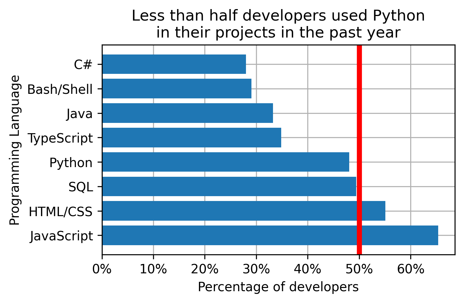
# plot preparation
fig = plt.figure(figsize = (5,3))  # set the figure size (Width, Height)
ax = plt.gca()  # get the axis from the plot
# plotting
handle_bars = plt.barh(programming_languages, past_year_use)  # the plot
# fine tuning
plt.title('Less than half developers used Python\n'
          'in their projects in the past year')
plt.xlabel('Percentage of developers')
plt.ylabel('Programming Language')

plt.grid(True)          # show the grid
ax.set_axisbelow(True)  # set grid lines to the background

add_percentage = lambda value, tick_number: f"{value:.0f}%"       # function that adds % to tick value
ax.xaxis.set_major_formatter(plt.FuncFormatter(add_percentage))   # apply the tick modifier to x axis

plt.axvline(50, color='r', linewidth=4)  # 50% cutoff vertical line (axhline for horizontal)

plt.savefig('pics/demo_bar_plot_rp.png', bbox_inches='tight', dpi=300)
plt.show()A legend displays names of different layers of the plot. The default order of the layers can be mixed up. Moreover, some of the layers, like the bars on our plot, are already defined with the x label and can be spared from additional attention. The auxiliary line, on the other hand, requires some explanation.
Individual layers should be assigned to the corresponding handles and added individually with the corresponding names in order of importance. The location argument helps positioning the legend in a way that does not obstruct the areas of high importance.
handle_vline = plt.axvline(50, color='m', ls='--')  # 50% cutoff vertical line (axhline for horizontal)
plt.legend([handle_vline],                          # layers handles
           ['majority cutoff'],                     # layers names
           loc='upper right')                       # legend position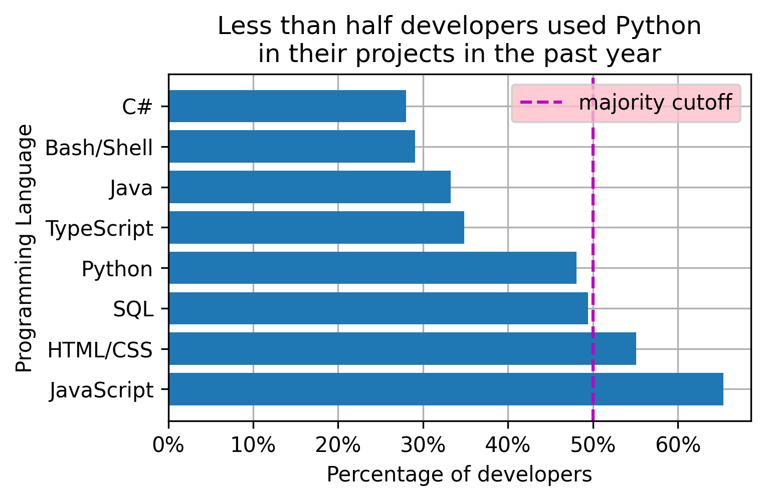
# plot preparation
fig = plt.figure(figsize = (5,3))  # set the figure size (Width, Height)
ax = plt.gca()  # get the axis from the plot
# plotting
handle_bars = plt.barh(programming_languages, past_year_use)  # the plot
# fine tuning
plt.title('Less than half developers used Python\n'
          'in their projects in the past year')
plt.xlabel('Percentage of developers')
plt.ylabel('Programming Language')

plt.grid(True)          # show the grid
ax.set_axisbelow(True)  # set grid lines to the background

add_percentage = lambda value, tick_number: f"{value:.0f}%"       # function that adds % to tick value
ax.xaxis.set_major_formatter(plt.FuncFormatter(add_percentage))   # apply the tick modifier to x axis

handle_vline = plt.axvline(50, color='m', ls='--')  # 50% cutoff vertical line (axhline for horizontal)
plt.legend([handle_vline],                          # layers handles
           ['majority cutoff'],                     # layers names
           loc='upper right',                       # legend position
           facecolor='pink')

plt.savefig('pics/demo_bar_plot_lgnd.png', bbox_inches='tight', dpi=300)
plt.show()The above manipulations are applicable to the major plot types, including line plots, bar plots, box plots, etc. Plot-type-specific manipulations use additional capabilities available for the specific plot type to further clarify the message. The horizontal bar plot from the example above can benefit from highlighting the bar of interest, listing the bars in a descending order, and adding the values numbers to the bars:
python_ix = programming_languages.index('Python')  # find the Python bar position
handle_bars[python_ix].set_color('C2')             # set the Python bar to a different color
ax.invert_yaxis()                                  # make bars display from top to bottom vs the default
for pos, val in enumerate(past_year_use):          # print values on the bars
    ax.text(val, pos, f'{val:.0f}% ',
            verticalalignment='center', horizontalalignment='right',
            color='white', fontweight='bold')
plt.box(False)                                     # turn off the box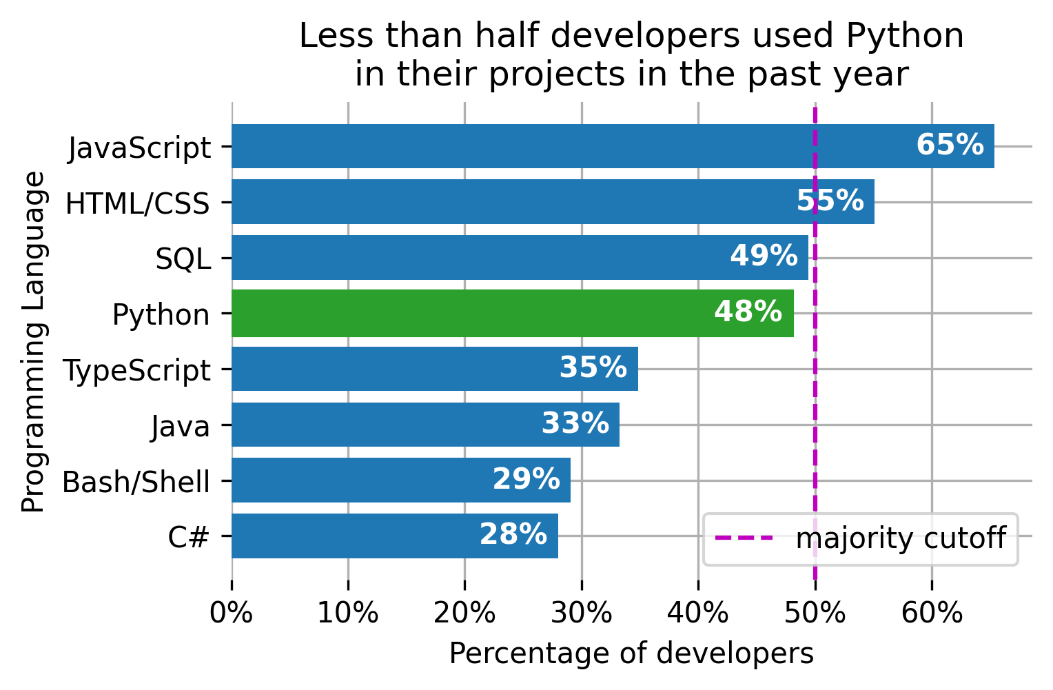
# plot preparation
fig = plt.figure(figsize = (5,3))  # set the figure size (Width, Height)
ax = plt.gca()  # get the axis from the plot
# plotting
handle_bars = plt.barh(programming_languages, past_year_use)  # the plot
# fine tuning
plt.title('Less than half developers used Python\n'
          'in their projects in the past year')
plt.xlabel('Percentage of developers')
plt.ylabel('Programming Language')

plt.grid()              # show the grid
ax.set_axisbelow(True)  # set grid lines to the background

add_percentage = lambda value, tick_number: f"{value:.0f}%"       # function that adds % to tick value
ax.xaxis.set_major_formatter(plt.FuncFormatter(add_percentage))   # apply the tick modifier to x axis

handle_vline = plt.axvline(50, color='m', ls='--')  # 50% cutoff vertical line (axhline for horizontal)
plt.legend([handle_vline],                          # layers handles
           ['majority cutoff'],                     # layers names
           loc='lower right')                       # legend position

# plot specific modifications
python_ix = programming_languages.index('Python')  # find the Python bar position
handle_bars[python_ix].set_color('C2')             # set the Python bar to a different color
ax.invert_yaxis()                                  # make bars display from top to bottom vs the default
# print values on the bars
for pos, val in enumerate(past_year_use):
    ax.text(val, pos, f'{val:.0f}% ',
            verticalalignment='center', horizontalalignment='right',
            color='white', fontweight='bold')
plt.box(False)                                     # turn off the box

plt.savefig('pics/demo_bar_plot.png', bbox_inches='tight', dpi=300)
plt.show()The plot manipulation code above might seem custom. In reality, most of the commands stay the same from one graph to another while the functions' parameters change based on the data at hand. I will use the earlier mpg example to demonstrate this effect. The resulting plot looks as follows:
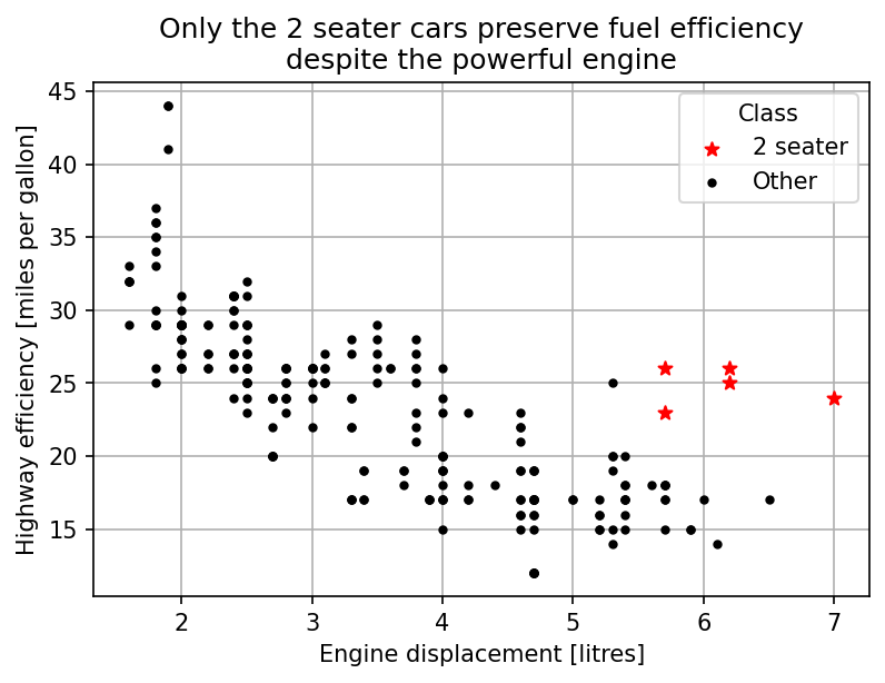
Despite a different plot type, the fine tuning code was almost the same. The code for vertical lines and tick modifiers did not offer additional clarity and was removed along with the bar plot specific part. The only addition was the `title` parameter for the legend. The resulting code is shown below.
import pandas as pd
import matplotlib.pyplot as plt

df_mpg = pd.read_csv("https://vincentarelbundock.github.io/Rdatasets/csv/ggplot2/mpg.csv", index_col=0)
df_2seaters = df_mpg[df_mpg['class'] == '2seater']
df_other = df_mpg[df_mpg['class'] != '2seater']

# plot preparation
plt.figure(figsize = (6,4))  # set the figure size (Width, Height)
ax = plt.gca()
# plotting
handle_2seater = plt.scatter(df_2seaters['displ'], df_2seaters['hwy'], color='red', marker='*')
handle_other = plt.scatter(df_other['displ'], df_other['hwy'], color='black', marker='.')
# fine tuning
plt.title('Only the 2 seater cars preserve fuel efficiency\n'
          'despite the powerful engine')
plt.xlabel('Engine displacement [litres]')
plt.ylabel('Highway efficiency [miles per gallon]')
plt.grid(True)
ax.set_axisbelow(True)
plt.legend([handle_2seater, handle_other], ['2 seater', 'Other'], title='Class')
plt.savefig('pics/2seater.png', bbox_inches='tight', dpi=150)
plt.show()The examples above demonstrated that some standard commands are frequently used. Memorizing that code is not the biggest problem. The main problem is that it takes a long time to put together the same lines with slight changes for each plot. Below, I propose several strategies for reducing the amount of effort required to memorize and put together the code.
Default plot settings can be changed in one place and propagated to all the downstream figures in a jupyter notebook. For example, the default grid behavior and the default figure size can be changed in the following way:
plt.rcParams['figure.figsize'] = [5, 3]
plt.rcParams['axes.axisbelow'] = True
plt.rcParams['axes.grid'] = True
The full list of the settings, options, and the defaults can be found here.
Rewriting the global defaults saves the coding time for the commands that stay the same despite the context. However, the approach still requires looking up the rcParams settings, adding these settings to each new notebook, and typing content specific commands. The next approach will take care of the content-specific commands.
This approach will take care of content-specific commands. Just save the template somewhere and copy it every time to finish the plot. Content-specific parts are easy to modify without memorizing all the necessary commands. The template below works well for the majority of my cases:
# plot preparation
plt.figure(figsize = (5,3))  # set the figure size (Width, Height)
ax = plt.gca()
# plotting

# fine tuning
plt.title('Title')
plt.xlabel('x')
plt.ylabel('y')
plt.grid(True)
ax.set_axisbelow(True)
ax.xaxis.set_major_formatter(plt.FuncFormatter(lambda value, tick_number: f"{value}" ))
handle_vline = plt.axvline(50, color='r')
plt.legend([handle_vline], ['reference'], loc='best')
plt.savefig('pics/file_name.png', bbox_inches='tight', dpi=150)
plt.show()
The template can be modified if you use other commands quite a lot. The major inconvenience with this approach is that you have to carry the template around in a separate file and pull the code from that file every time it is needed. Not the end of the world, but annoying.
The %macro magic captures a piece of code for future retrieval or execution. Just name the pattern and point the magic to the jyputer cell that holds the template code. Say, the template code is in cell 10 and I picked the name fine_tune for it. The following command will associate the code with the name:
%macro -q -r fine_tune 10
By using the following command, the code can be retrieved anywhere:
%load fine_tune
The next step is to make the template available for other notebooks. The %store magic does the job. Its primary use is to share the variables between the notebooks. fine_tune is one of such variables. The following line stores template macro variable internally:
%store fine_tune
The following command makes the template available in the notebook where it is needed:
%store -r fine_tune
After that use %load fine_tune when you want to put the plot together.
# # plot preparation
# plt.figure(figsize = (5,3))  # set the figure size (Width, Height)
# ax = plt.gca()
# # plotting

# # fine tuning
# plt.title('Title')
# plt.xlabel('x')
# plt.ylabel('y')
# plt.grid()
# ax.set_axisbelow(True)
# ax.xaxis.set_major_formatter(plt.FuncFormatter(lambda value, tick_number: f"{value}" ))
# handle_vline = plt.axvline(50, color='r')
# plt.legend([handle_vline], ['reference'], loc='best')
# plt.savefig('pics/file_name.png', bbox_inches='tight', dpi=150)
# plt.show()


In [ ]:
%macro -q -r fine_tune 10
%store fine_tune


In [ ]:
# retrieve in the new notebook if planning to use
%store -r fine_tuneFor those who would go an extra mile to make the templates available without typing %store -r every time, there is a way to achieve this. This command can be executed as a part of the script that jupyter runs while opening a notebook. Run the following command to check whether the script exists:
import os.path

ipython = !ipython locate
file_name = f'{ipython[0]}/profile_default/ipython_config.py'
os.path.isfile(file_name)
If the script does not exist (the last command returned False) the following command creates it:
!ipython profile create
Edit the file from file_name the following way:
In my example, the following piece of code will be changed from:
# c.InteractiveShellApp.exec_lines = []
to
c.InteractiveShellApp.exec_lines = [
    '%store -r fine_tune'
]
The following script will automate the process of adding new templates.
import os.path

new_template_names = ['fine_tune']

# config folder path
ipython = !ipython locate
file_name = f'{ipython[0]}/profile_default/ipython_config.py'
# search patterns for commented and uncommented lines
exec_line_default = '# c.InteractiveShellApp.exec_lines = []\n'
exec_line = 'c.InteractiveShellApp.exec_lines = [\n'

# create the config files if not there
if not os.path.isfile(file_name):
    !ipython profile create

# read the config file
with open(file_name) as f:
    lines = f.readlines()

# uncommenting the part with line execution if commented
if exec_line_default in lines:
    # find the commented line
    setting_position = lines.index(exec_line_default)
    # replace with uncommented
    lines[setting_position] = exec_line
    # add the closing bracket
    lines.insert(setting_position+1, ']\n')

insert_position = lines.index(exec_line) if exec_line in lines else -1

# add the template loading lines
for template_name in new_template_names:
    # shape the storage request line
    new_line = f"    '%store -r {template_name}',\n"
    # add the line if not already there
    if not new_line in lines:
        insert_position += 1
        lines.insert(insert_position, new_line)

# write the updated config file
with open(file_name, mode='w') as f:
f.writelines(lines)Putting together a visualization that speaks for itself at a stakeholder meeting is laborious. The number and variety of context-dependent commands that go with such a graph makes the process hard to automate and embed in a single plotting function. Memorizing the commands is tedious, and typing them over and over for each new visualization is time consuming.
In this post, I showed how to use code templates to save time and effort while finalizing a data plot. Such template contains the most used commands and placeholders for the context-dependent parts. I also showed how to load the template code fast using a jupyter magic.
No terms found for this post.

Artificial Intelligence (AI) extensively powers high stakes decision making. Job candidate screening, credit scoring, school admission, healthcare diagnostics and maintenance in critical infrastructure rely heavily on Machine Learning (ML) models. T...
No terms found for this post.

You may have read our previous guide Databricks, Fabric, or Snowflake: The Big Three Explained , which laid out the core differences in design and positioning for today’s leading cloud analytics platforms. If you haven’t, no problem—this post stands...

Want to reduce your cloud data warehouse costs by 20–40%? This guide walks you through 11 practical SQL query optimizations